Forgotten Forest Redux (Combat Demo)
A downloadable game for Windows
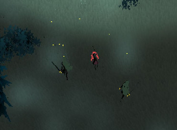
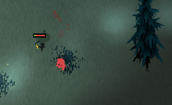
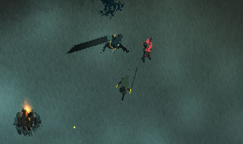
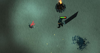
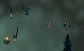
Hey there and thanks for stopping by! This is the combat demo for a project I'm working on! The Forgotten Forest is a hack'n'slash isometric game inspired by games like hyperlight drifter, hades and even old games like golden axe! I'm working on the combat currently as it's what the player will be doing the most of (For Now....)I'd really appreciate it if you'd drop some feedback in the comments. Be as elaborate as possible :)
Press R to restart
Mainly,:
1. The control scheme did it feel alright? Comfortable? easy to play?
2. Did you enjoy the enemy types? Do you think they need to be More varied in the way they behave?
3. What enemy types would you like in the game? Ranged, Tanky, feel free to elaborate! or Mention something I've not thought of!
4. If you could add ANYTHING to this what would it be?
5. Did you enjoy the art style?
6. With The players health was that clear it was their health?
| Status | Released |
| Platforms | Windows |
| Author | JACKMCPHERSONGAMES |
| Genre | Adventure |
| Tags | 3D, Fantasy, Hack and Slash, Isometric, Retro |
Comments
Log in with itch.io to leave a comment.
Hi Jack,
These are my thoughts on the game so far;
1. The control scheme did it feel alright? Comfortable? easy to play?
the controls scheme i used was "WSAD" for movement, "Spacebar" for dash and "Left Click" for attack. This felt fine but the player did feel a tad sluggish. the animations for attack felt good however you can increase the range of your swing to a 360 attack by holding the opposite directrion to where your facing mid swing which makes hitting enemys extremly easy. the dash feels good. origionally i thought that you would get a moment of invunrability with the dash but it turned out that its just for movement which is perfectly ok by me. However the dash button was said in the controls as [right shift] but was the [spacebar].
2. Did you enjoy the enemy types? Do you think they need to be More varied in the way they behave?
the bigger enemys felt interesting to me as it felt like a mini boss battle with the unique animations for attacks. the smaller guys felt insignifficant as i was able to kill them before they threw their first attack and when they did land an attack, the damage felt insignificant. Thus bigger enemy felt like the only enemy i needed to worry about. The attacks felt too long apart as i was able to get 3-4 hits in before the attack animation played. I think maybe if the smaller guy was a tad quicker with a bit of a faster animation it could make it feel more threatining. while playing a tactic i used was to kill the small guys quickly as i can kill them before they even swing at me and now i have a few big guys to worry about. I also think that the big guys need a small gap closer. maybe a weaker version of the dash the player has when playing the upswing animation to get a bit closer. I feel this way as after taking out the smaller guys, it became trivial to kite all the big guys up and attack them together as they did not have a way to close the distance between us when i dash out. I felt a threat from the bigger guys but not from the smaller guys. Some animations feel the same but on closer look there is a subtle difference so i dont think the enemy need a lot of different attack types/ patterns but maybe a few. I do think the pathing of the smaller enemys needs work as when i was trying to see how many attacks it had, i was able to run along side it and it was not coming towards me.
3. What enemy types would you like in the game? Ranged, Tanky, feel free to elaborate! or Mention something I've not thought of!
I do think that there should be more enemy types as that would force the player to consider the environment more and where to kite. i feel like both an archer or a mage could be a good idea. a ranger would be able to fire arrows in the direction of the player while keeping its distance whereas, a mage could through fire onto the grould preventling you from steping into the fire unless you want to be burnt. maybe an axe thrower where after it throws the axe it runs to retrieve it before throwing it again. maybe a necromancer who can bring back fallen enemy's back.
4. If you could add ANYTHING to this what would it be?
I'm not to sure on the type of game you want to make it but maybe more of the world such as forts/ruins/castle/ dense forrests/ etc.... or something with the fireflys / fairys floating around. maybe they lead you to somewhere or maybe some enemy types are scared of them. Maybe a travelling merchant to trade and get better gear. Maybe a third party which attacks the current enemy.
5. Did you enjoy the art style?
I did enjoy the artstyle as it did remind me of old school runescape a bit but it did take me a few runs for my eyes to completly adjust to what was onscreen as somethings blend in with others, as the game itself has very dark colour scheme. i felt the wind helps with the immersion of the game.
6. With The players health was that clear it was their health?
I do think the healthbars were clear but i dont think the artstyle of the health bars fits too much with the rest of the game. however sometimes when you hit an enemy the healthbar doesn't show up. Also when the health bar shows the enemy as having no health the enemy is still able to move around and attack. I tested this on both enemy types and with the same amount of swings required to kill an enemy. some enemys die and some are still able to fight even with no hp as shown on the health bar. maybe a way to better show how much damage you are doing to an enemy as i am currently keeping track of how many times i have hit them as i do not have a way to measure the amount of damage i am able to deal. Or maybe if the health is <x% (e.g. <1%) then the enemy dies rather than it reaching 0 as it would look the same to the player.
Some bugs i found
1. on my first playthrough i went into the controls to figure out what the keybindings were, i then pressed play and thought the game dident rejester so i spammed exit thinking the game was buged while pressing random keys to see if the game was responding. when i got put into the game, my character started doing 360's and attacking without my input aswell as an audion bug which sounded like a loud beep trying to play something.
2. you are still able to keep attacking/ moving even after your death animation by attacking.
3. you are able to clip through the southwest rock from the back by trying to walk through it. i found that walking southeast from behind the rock is the easiest way to replicate this.
4. not sure if its a bug but, you are able to leave the floating island on all sides and float except the south side where there is an invisible wall i feel pushed too far inland.
5. I feel like the tree hitboxes are far too big for what the trees are. i feel like i should beable to get up to next to the trunk of a tree.
Summary
Overall i feel, that the combat feels good but a bit sluggish. Some more variety on the different types of enemys is needed. but generally in a good spot.
Hi Jack :)
I have played your game and answered your questions in your comments, hope they are useful to you!
1. The control scheme did it feel alright? Comfortable? easy to play?
I managed to kill all the enemies in quite an intuitive way, so I would say yes, but I would say just have something on the screen to tell new players the controls, that way they don't get lost at the first hurdle.
2. Did you enjoy the enemy types? Do you think they need to be More varied in the way they behave?
The enemies felt fairly good to fight, as I found myself having to move around to avoid attacks, and try to hit them when they were not attacking. However, I am not sure that the differentiation between "enemy types" is great enough, as they are both similar in size, humanoid, and wielding similar weapons. A greater difference between the characters would help to mentally categorize the different enemy types.
3. What enemy types would you like in the game? Ranged, Tanky, feel free to elaborate! or Mention something I've not thought of!
I think a ranged enemy is always good as it means you can't just stick to one method of attacking every single enemy. However, I think if you are to introduce more enemy types, such as ranged, you should make it possible to defend against each of them, otherwise you will end up with enemies that people don't like fighting (I think).
4. If you could add ANYTHING to this what would it be?
I would like to see more of the game for sure. Exploring the dark forest environment, and others. This demo shows off the combat well, but I would definitely like to see how you explore other elements of the game next time a demo is released
5. Did you enjoy the art style?
I'm quite easy when it comes to art style, and I think any art style can be done well, so short answer is YES. However, something I noticed is that because as the screen is pixelated, sometimes objects end up being less than a pixel thick, such as the swords on the enemies. You might need to make some of your sword models disproportionately thick to make sure that they don't end up being less than a pixel thick.
6. With The players health was that clear it was their health?
The sword on the top is the health, and I have worked that out. However, it is not easy to see mid fight, as I don't want to look away from the screen Centre, and it is not easy to work out when I take damage, as there is a lack of feedback on that. For that reason I died without realizing I took any damage during a fight.
Overall, good start and well made demo, makes me excited to see what you are going to do in the next version of "Forgotten Forest Redux"